 ← Home
Summary
I redesigned Genomics’ genetic testing marketing site to boost adoption during scale-up. I created a new product identity, clarified the value proposition with fresh content, and resolved trust concerns through transparency pages and usability testing. The redesign drove a 5.3 percentage point increase in account-creation to 59.3%, breaking healthcare benchmarks.
Problem
In late 2022, Genomics invited 3,000 MassMutual policyholders to discover their genetic risk of common health conditions as a free benefit. 54% created an account from the landing page. Surveys showed the rest lacked clarity as to the value of the test and who was behind it. Many worried about data security and any hidden costs despite the free benefit. Without resolving these pain points, the scale-up risked lower adoption and weaker customer buy-in.

What I did
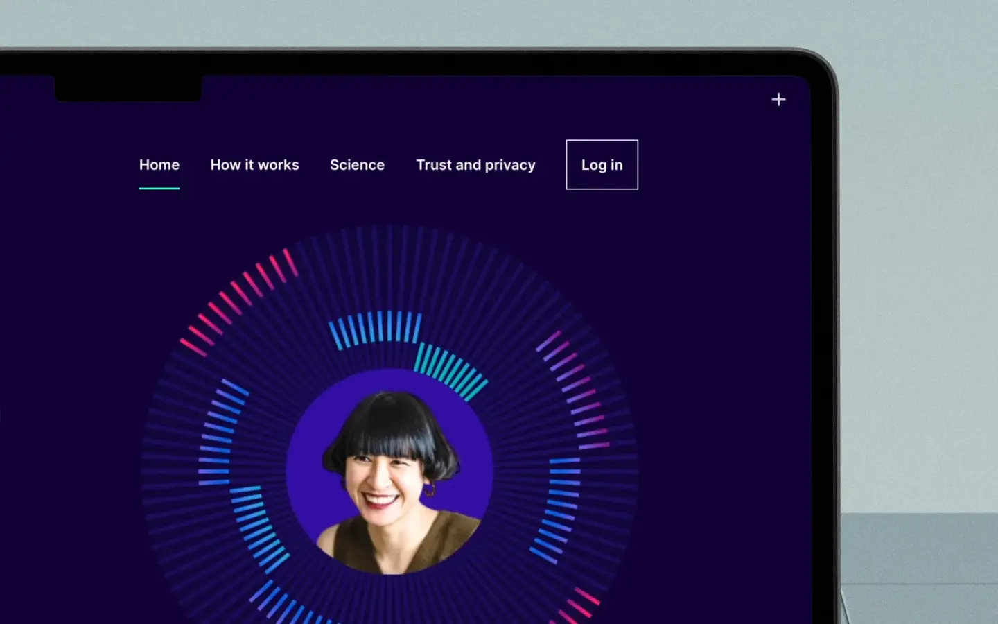
Created a product identity that built trust and supported conversion
- Genomics lacked a product identity, which undermined trust and adoption. I proposed and validated the name Health Insights through a naming survey, where it ranked top.
- For speed, I extended the existing Genomics brand as a visual identity, increasing the use of navy and introducing bold patterns to stand out from light-toned competitors.
- I created an initial design system with accessible tokens and components in Figma, ready for cross-team use.


Added content that removed privacy and cost concerns
I worked with executive and legal teams to design an About us page featuring founder and medical staff bios, published research, and media coverage.


To address privacy concerns, I added a Trust and privacy page with explicit statements on non-sharing with third parties, GDPR and ISO27001 credentials, and how patients controlled their data.

I created FAQ content that explained why insurers offered the free-benefit test, assured that there are no hidden costs and reiterated how the test is different from competitors.

Redesigned content to clarify value and drive sign-ups
I added a sample report to the homepage hero as an easy way to show what patients would receive, adapting a pattern from other genetic services.

The How it works section was buried on the home page. I promoted it in hierarchy, created a dedicated page and new content describing how we use patient genetic data to generate results and what patients could do with them.

To simplify Science as much as possible, I worked with the science and medical teams to reduce jargon.

Tested to uncover confusion and improve decision-making
I ran a moderated usability test with 5 participants from our target demographic (35–70, US, life insurance). Findings:
- Only 2 of 5 participants said they would create an account.
- Most were confused by the sample report, which raised questions better handled post-report.
- Several wanted clearer differentiation from competitors and more transparency on founders and medical staff.
I want to know more about the doctors, where they went to school, how long they’ve been in the field, other professional experience, if they’re invested in the company.
Jack, 40

Iterated to simplify the test representation
To resolve sample report confusion, I explored alternatives to represent the test that balanced detail with simplicity.


I partnered with the Lead Product Designer (working on another project) on this and adopted his circular representation. I animated it using avatars to show how results vary between individuals, reflecting the polygenic (not one gene but many) nature of the test.


Created a competitor comparison to drive uptake
- To help patients evaluate the test, I looked at previous research on patient motivations and found that perceived test accuracy was a top factor in how many chose between tests.
- I created a comparison chart of competitor accuracy using newly published AUC (area under the curve) data from Genomic Prediction, 23andMe, and internal sources.
- The chart emphasised Health Insights’ stronger PRS (polygenic risk score) performance and guided patients to the Science page for a more detailed view.


Added clarity on key personnel to boost trust
To meet patient requests for transparency, I expanded executive and medical professional bios to include where individuals studied, their history, and why they joined the company.

Observed an increase in account-creation intent
An additional usability test showed:
- 4 out of 5 participants would create an account
- All found the comparison chart useful, and often went to the Science page as a next step.
- Some thought the animation helpful for understanding the test
- Some felt the expanded bios gave extra confidence
Monitored market risks to protect conversion rates
- 23andMe had a data breach in October 2023. To understand whether this was a threat to account-creation, I ran a quick pulse survey with 50 individuals in our target demographic. I explained the breach to participants, asked them to view a prototype of the marketing site and answer attitudinal questions.
- Awareness of the breach was low (18%).
- The majority indicated they would still create an account. While the survey size was small, I decided not to proactively modify the site content in the absence of an obvious threat.
Results
- Account creation rose to 59.3% as of January 2024 since launch in December 2023, a 5.3 percentage point increase from the pilot’s 54%.
- The new product identity and visual system reinforced credibility at scale, helping sustain pilot-level conversion rates and enabling the 5.3 percentage point lift.
- At least 3.2% of total account-creation came directly from Science, the largest of any other page, suggesting the new content gave more policyholders a better understanding of the test.
- The service outperformed healthcare benchmarks, where account-creation rates typically stayed below 40%.
- Genomics strengthened its customer value proposition.
Final designs:


Let’s talk
If you need to drive adoption of digital health products, I can help you design trust-building flows.
