When 1 in 10 patients get no result
Cutting genetic kit reject rate from 10% to 0.3% on a free-benefit partnership.
- 10% → 0.3% lab reject rate
- £3,200 saved per 1,000 kits
Context
A Series B healthtech scale-up offering polygenic risk score testing to US insurers, the same insurance partnership as the sign-up redesign. 1,620 patients enrolled, 1,367 returned a sample kit, and the lab rejected 10%. The reject rate blocked partnership growth and made the product harder to sell to other US insurers. Each rejected patient got no result, waited a week for a new kit, re-collected, and posted again. That broke trust at the most fragile moment of the service: the first deliverable. As sole designer, I led the cross-functional workshop, designed the kit, the online instructions, and the activation flow.
The problem
- Same insurance partnership as the sign-up work. 3,000 policyholders invited, 1,620 enrolled, 1,367 returned a kit. The lab rejected 137 of them.
- 5% had no patient date of birth on the sample device, so the lab couldn't identify whose sample it was. 5% had unusable or missing samples. A patient survey told us why: the instructions were complex.
- The cost (£33 per rejected kit, plus reships and support) was the visible problem. The hidden problem was bigger. A patient who waits two weeks for nothing, and has to repeat the process from scratch, stops trusting the service. On a free benefit with no patient stake, many walk away.
What made it hard
- A free benefit means patients have no skin in the game and abandon the service at the first sign of friction.
- A regulated sample device from a third party couldn't be modified.
- CLIA rules limited what I could say in instructions.
- US sample devices weren't available before US user testing began.
How I fixed it
-
Treated this as a retention problem, not an operational one
The goal was to reduce kit costs. The survey and lab data pointed at a different cause. Patients didn't lose a kit. They lost confidence in the brand at the first deliverable. On a free-benefit product, a single bad experience ends the relationship. There's no second chance because there was no commitment to begin with.
I reframed the brief. From 'cut wasted kits' to 'make sure every patient's first attempt succeeds'. That changed which problems I went after and in what order.
Why this mattered: A cost-led approach would have stopped at clearer paper instructions. The retention frame forced a system-level fix.
-
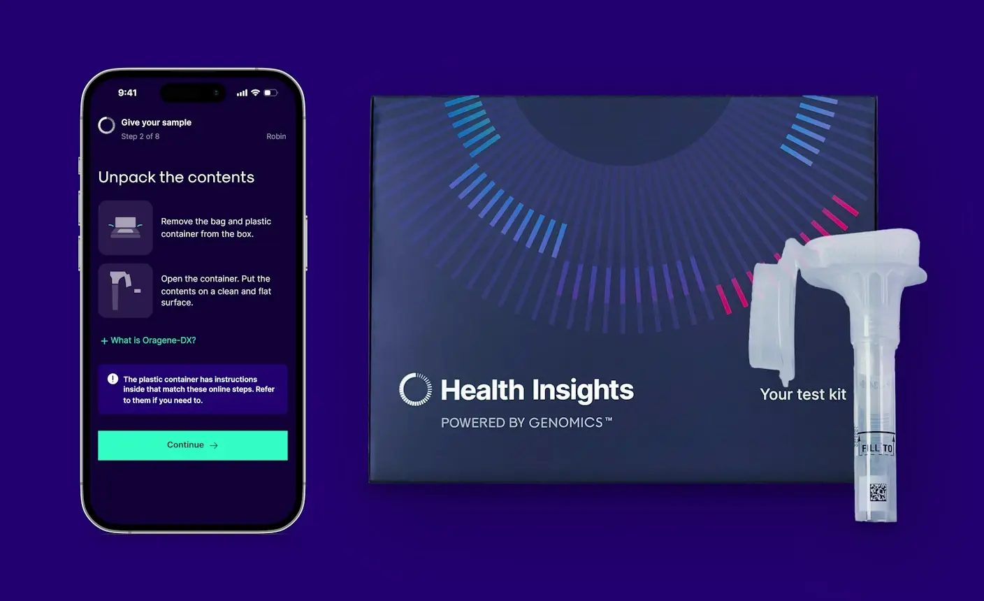
Engineered identification into the system
5% of kits arrived with no identifiable patient. The obvious fix was clearer prompts to write the DOB on the sample device. The obvious fix doesn't survive a panicking patient with a small ballpoint pen.
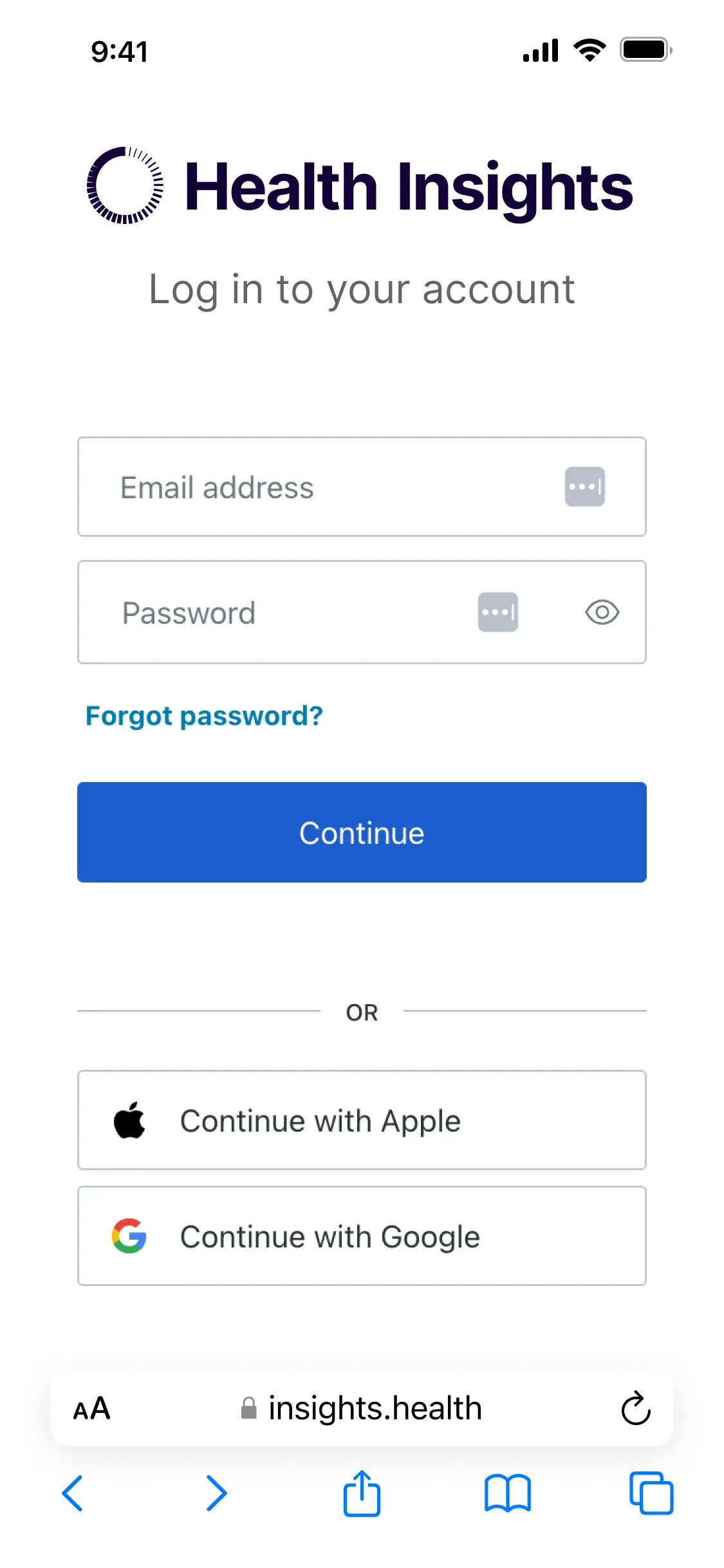
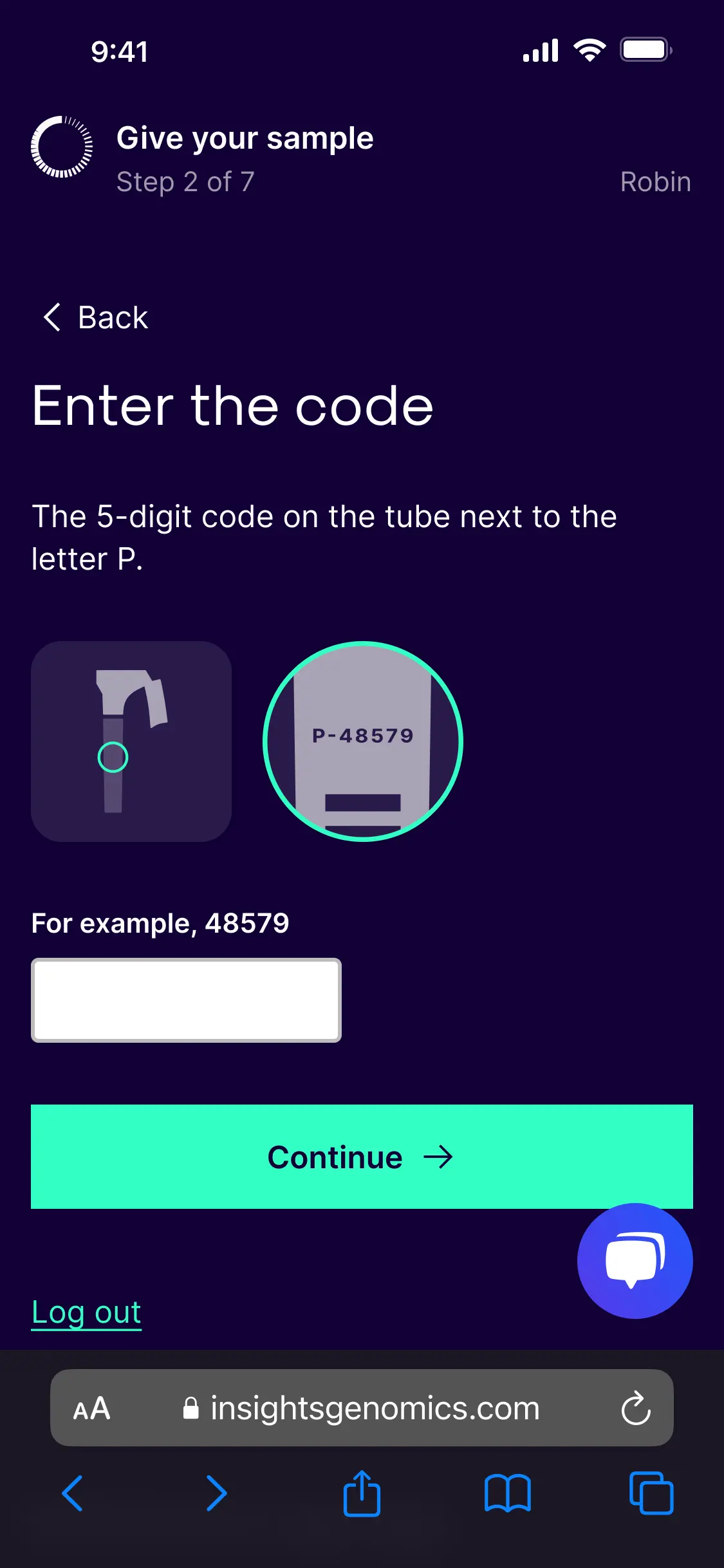
I ran a cross-functional workshop with product, engineering, supply, and regulatory. We went for a higher-effort solution: a five-digit activation code per kit, which the patient enters via the website before collection. The system validates the code in real time, links the kit to the patient at that moment, and gates progress until activation completes.
The result: every kit reaching the lab is identifiable. The 5% disappears at the system level, not at the handwriting level.
What made this hard: Selling a higher-effort solution to four teams with different priorities. The workshop did the work that a one-to-one pitch couldn't.
-
Used the physical kit as wayfinding to the online flow
Patients had a paper instruction sheet inside the kit, supplied by the sample device manufacturer. Regulations stopped me removing it. In the first round of testing, 3 of 5 patients picked up the paper before noticing the QR code.
The kit itself had to point patients to the digital flow. I pushed the supply chain team to invest £0.40 per kit (£320 per 1,000) on printing the inside panel of the box, the surface a patient sees on opening. I designed an eye-catching set of steps with a prominent QR. The freed-up space below the sample device went to clear signposting and a short note on the manufacturer partnership, since some testers had raised privacy concerns about an unfamiliar brand inside the box.
Analytics showed 65% of enrolled policyholders used mobile. I prioritised mobile while keeping the desktop path strong for older patients.
The judgement call: Spending real money on a printing change for a free-benefit product. The supply chain team needed evidence. The testing data gave them what they needed.
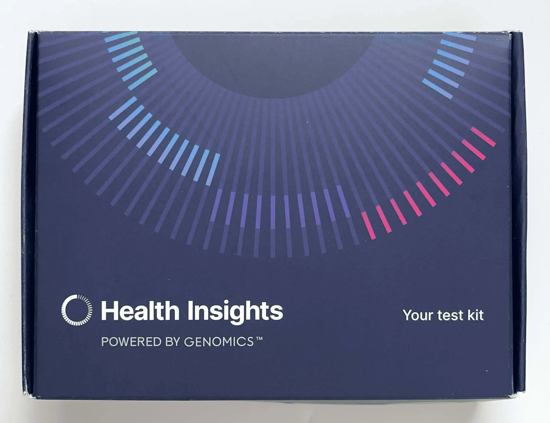
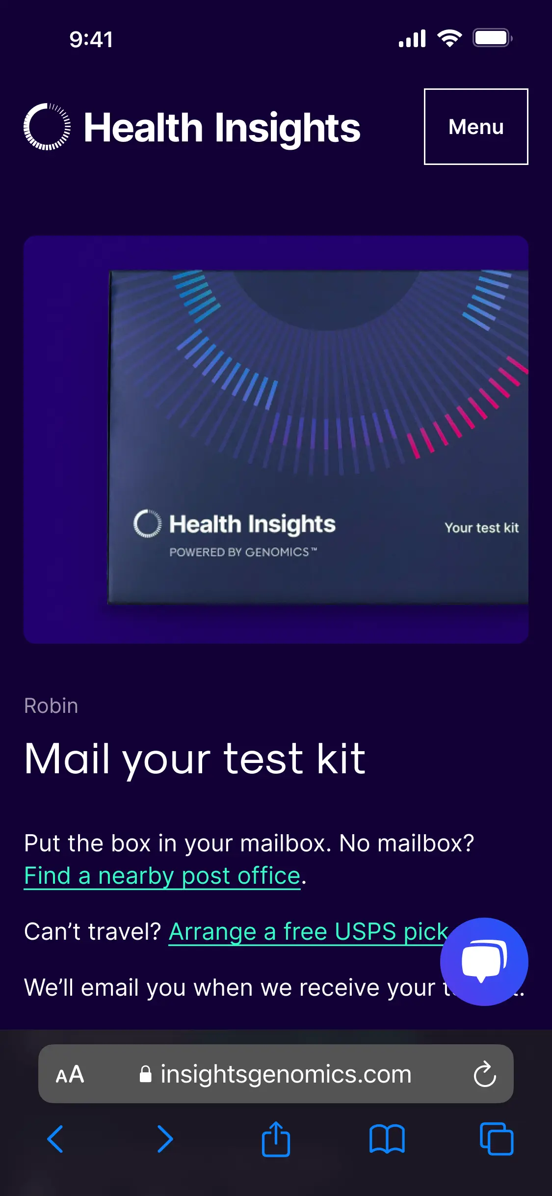
Front of test kit.
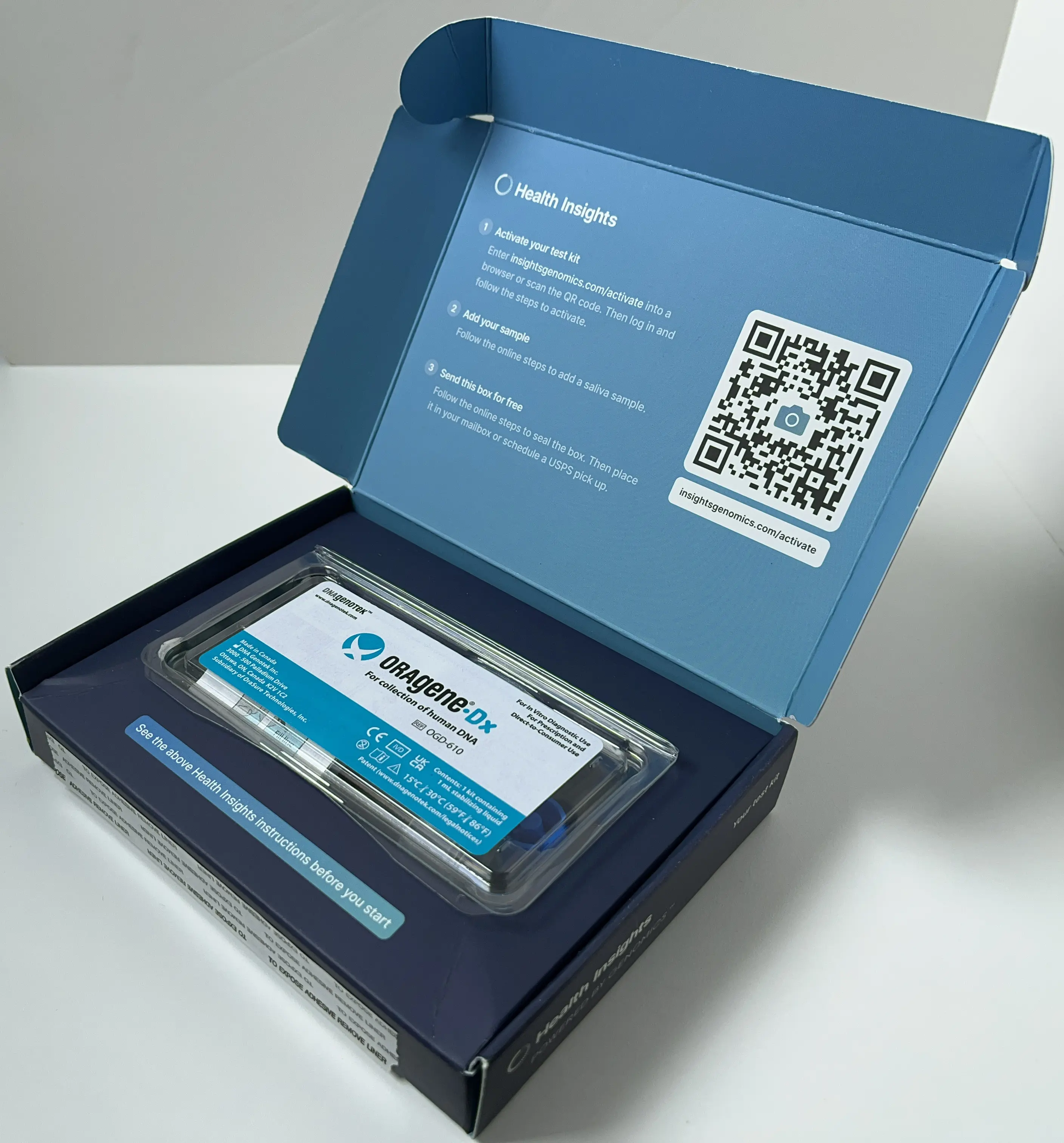
Open kit with new front panel.
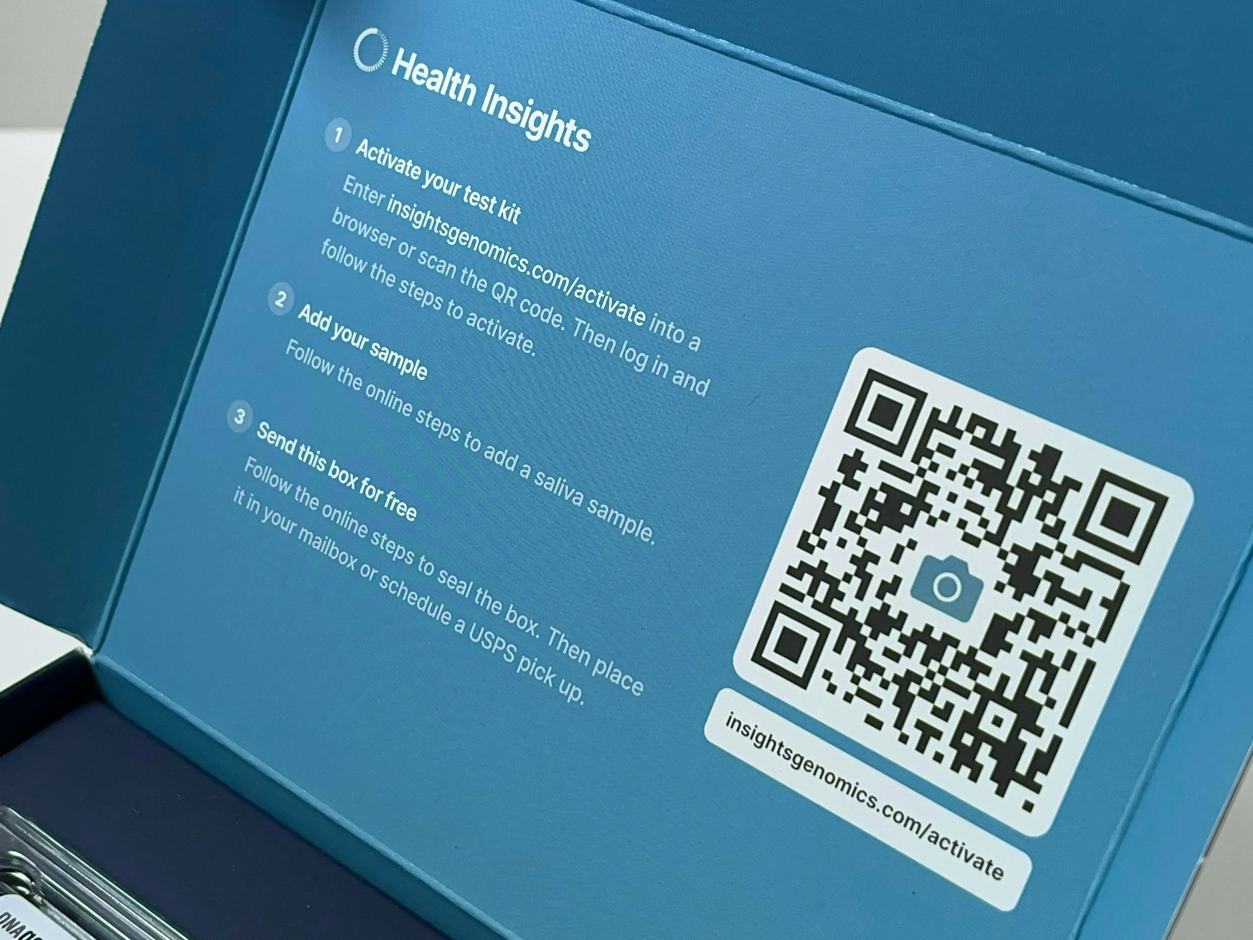
Front panel with QR entry to online journey.
-
Designed for stressed patients within regulatory walls
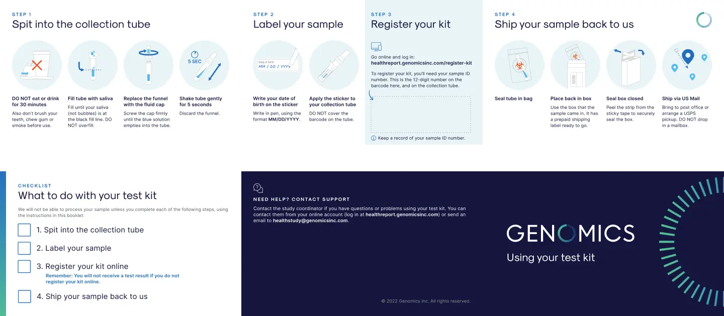
Sample collection is not a relaxed task. Patients are at home, doing something unfamiliar with their own saliva and a deadline. Instructions designed for ideal conditions fail in real ones.
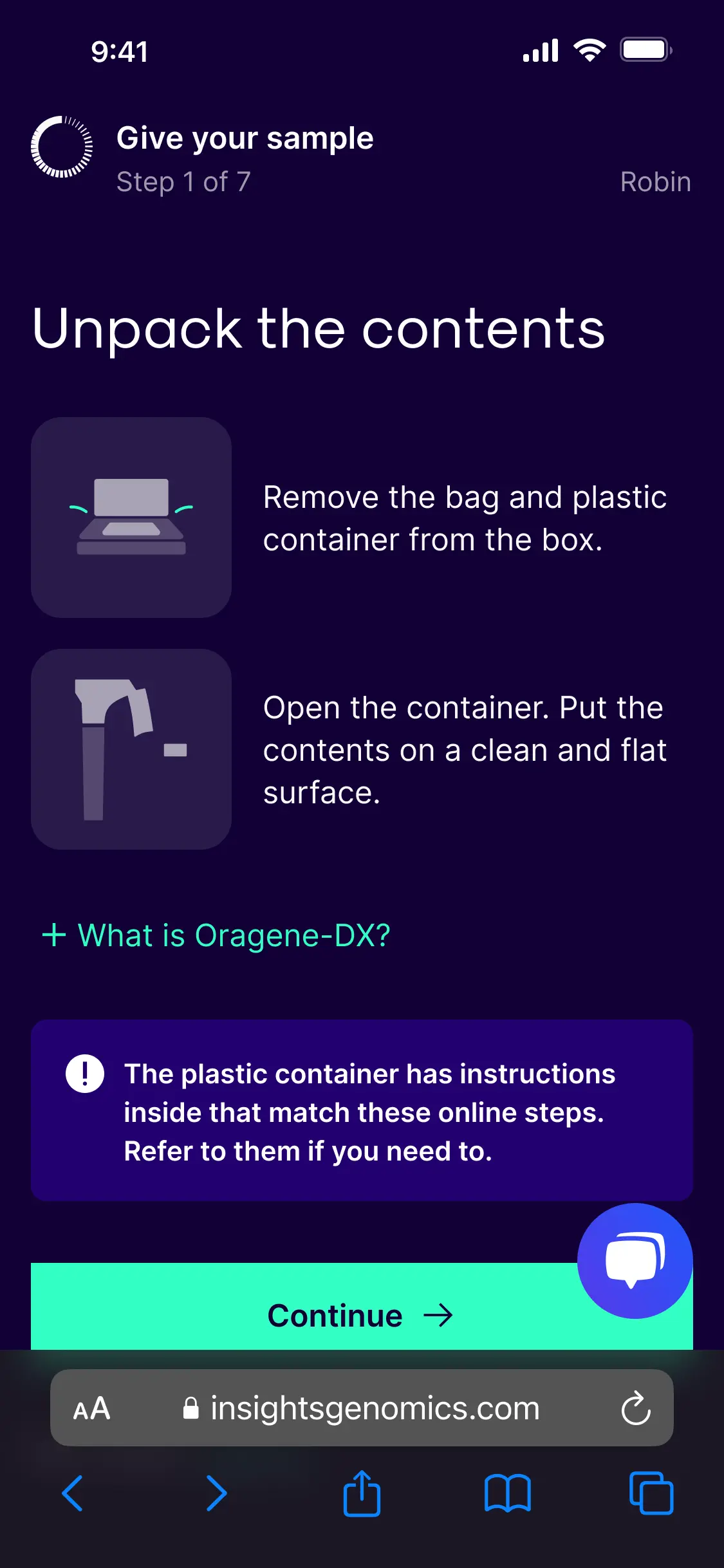
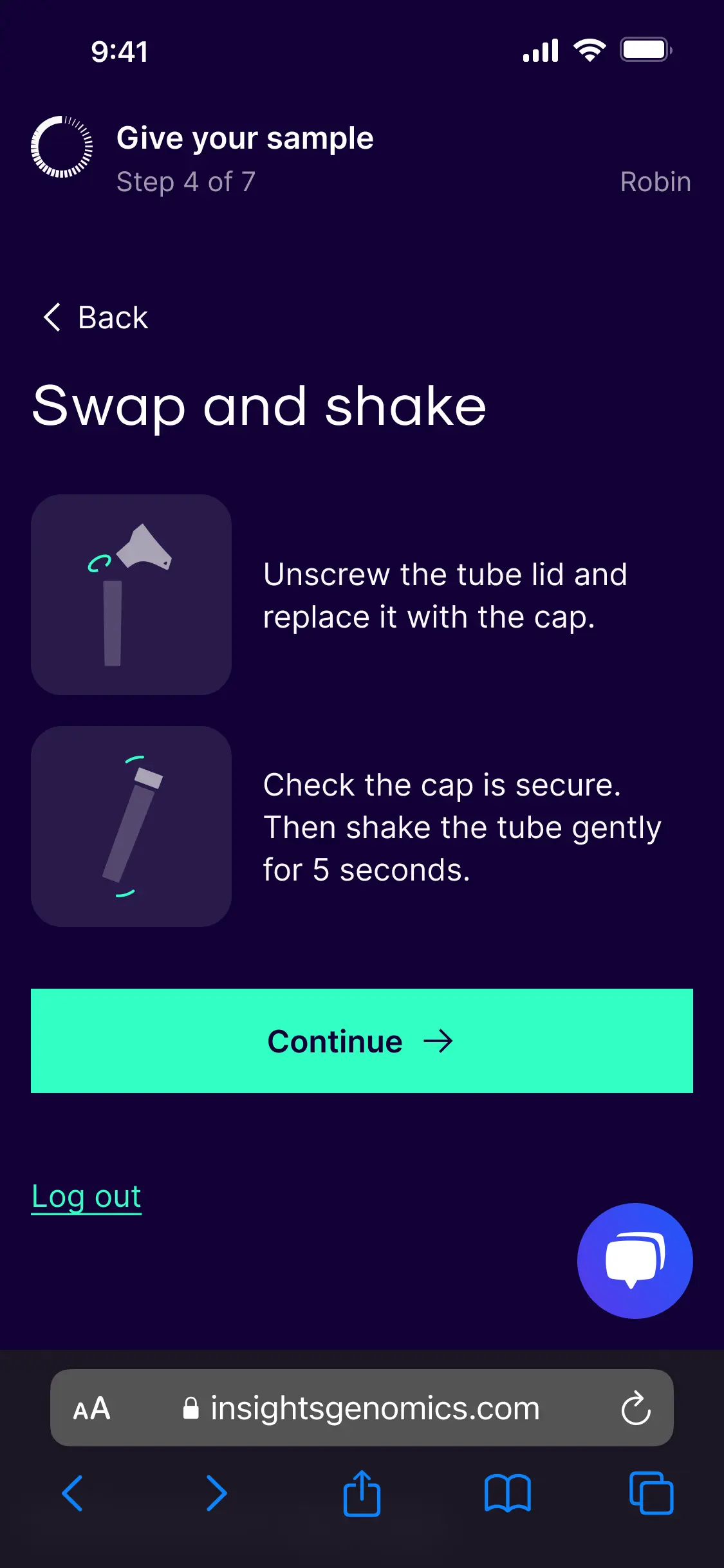
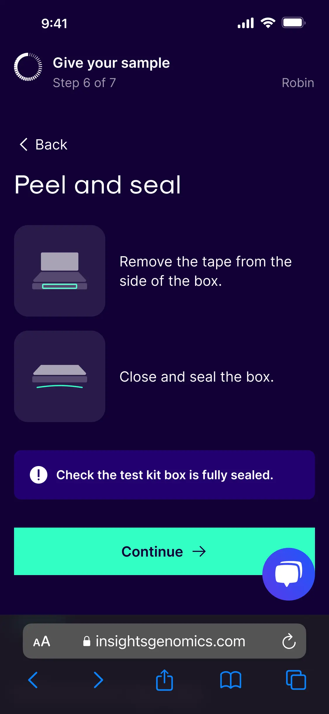
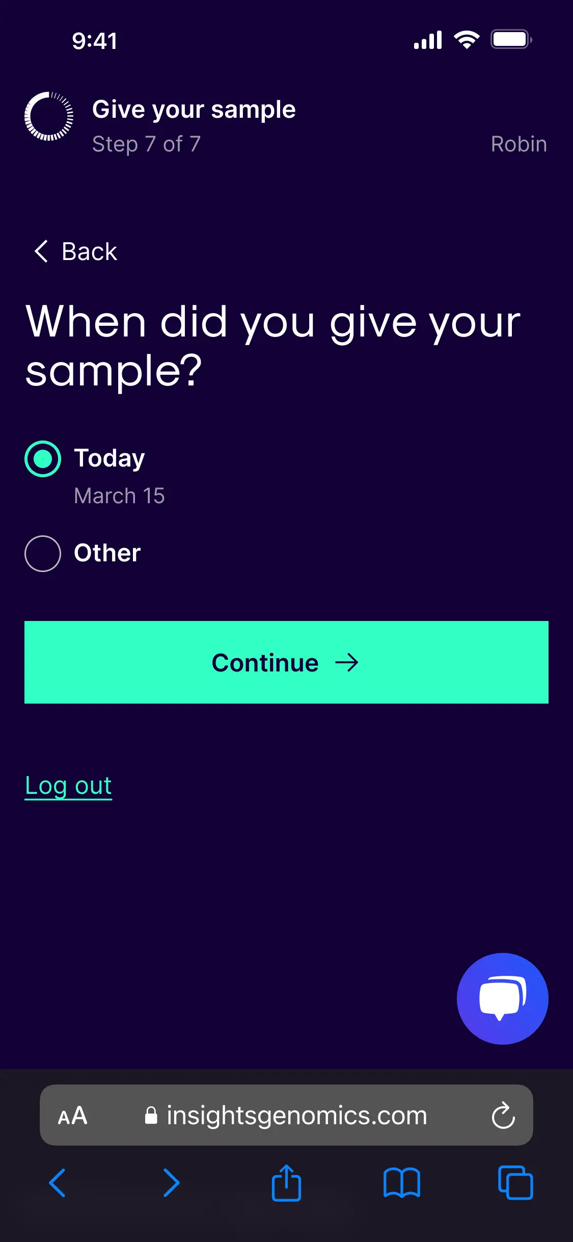
I built the online flow with one or two actions per page. Progressive disclosure. Simplified language. The pages responded to browser settings such as larger text. Every interactive element was keyboard-focusable.
The manufacturer's illustrations were off-limits, so I designed custom ones that matched the rest of the service identity. CLIA rules prevented me from telling patients to ignore the paper instructions. I asked patients to consult the paper if they got stuck, which the regulatory team approved.
A virtual usability test with 5 US colleagues showed no patients went to the paper, and all found the online flow clear.
Why this mattered: Regulatory limits aren't the enemy of good design. Working within them gets the design shipped. Fighting them stalls the project.
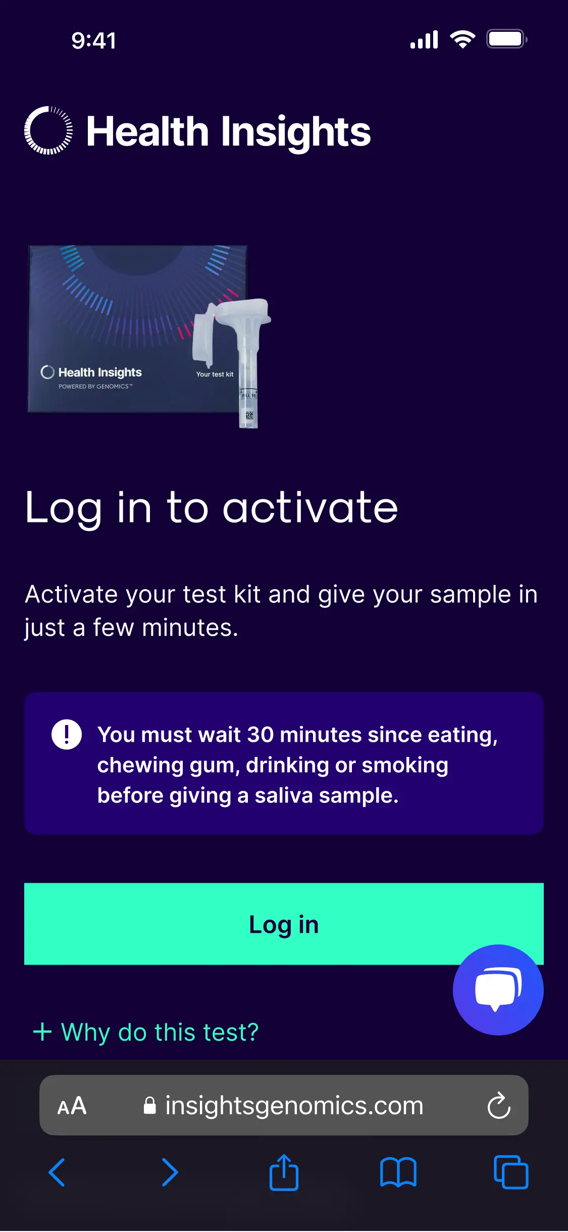
Steps in online journey


-
Took the pragmatic test route when the obvious one closed
The sample device manufacturer couldn't supply extra kits before US patient testing began. The choice: wait three weeks or test with what I had.
I ran in-person testing with 5 UK colleagues unfamiliar with the kit. They surfaced the paper-first behaviour, the box-versus-device confusion, and the privacy questions about the manufacturer. Each of those findings shaped the final design.
A delayed test would have delayed the launch. The pragmatic route kept the project on track and caught the critical risks.
What changed
- 133 more patients per cohort get a result on the first attempt.
- 90% of 518 delivered kits passed lab accessioning in the next cohort.
- The cohort grew from a 1,400-patient pilot to 1,620 in the redesigned phase.
Where this led
The fix removed the blocker to scaling the partnership. The US programme expanded to cover additional policyholders. The progressive disclosure pattern I built for the kit became the model for the wider sign-up flow.
Sound familiar? Get an audit of an underperforming flow in your health product.
- Screen-recorded walkthrough + shareable Notion report
- Every issue ranked by impact, with annotated screenshots
- Fixes ready for your team to action
- Not the clarity you needed? I'll make it right, or refund you
£2,500 + VAT. Delivered in 5 working days via email.